Care
Clear language, patient pacing, and space around the work. Warmth comes from the people, photography, and tone.

The complete visual and verbal identity for Reflexology Revisited. A clear, welcoming system for the school, its stories, and every next step.

CARE · CLARITY · CONFIDENCE
Reflexology Revisited is a welcoming place to learn, practise, reflect, and explore a practice of your own. The visual identity should give the learner room to concentrate.
Clear language, patient pacing, and space around the work. Warmth comes from the people, photography, and tone.
One clear next step. Consistent controls, readable lessons, and visible progress help people feel oriented.
Deep navy anchors the experience. The serif brings an editorial character. A small gold detail signals emphasis.
Use the approved foot-and-branch artwork. Choose a supplied variation to suit the surface and available space; keep the wordmark intact.
Default for white navigation, documents, and emails. Recommended width 180–240 px; minimum 150 px.
Download PNG
Use the inverse wordmark on solid navy. Keep the original gold and blue details in the emblem.
Download PNGA centred arrangement for covers and square compositions. Minimum 150 px wide.
Download PNG
Use when a horizontal wordmark would be too small. Give it more space above and below.
Download PNG
For tall covers or narrow print formats. Minimum 180 px wide; inspect the lettering at the final size.
Download PNG
For avatars, favicon, and supporting decoration. Minimum 40 px; use the complete name nearby when space allows.
Download PNGKeep clear space on all sides equal to one quarter of the emblem’s height. Align the horizontal mark to the content edge. Use its natural proportions and object-fit: contain.
Print starting points: 45 mm horizontal, 40 mm stacked, 50 mm vertical, 12 mm emblem. Confirm legibility on a proof.
Do not stretch, trace, retype, crop the wordmark, apply filters, add shadows, or place it on a busy photograph. Use the light or dark variant for a suitable background.
These approved logo files are PNG artwork, not editable vector masters. The generated lettering resembles the editorial serif; it is not a verified font identification.
Use a small, disciplined palette. White and soft neutral surfaces carry the learning; navy handles identity and actions. Gold is a supporting accent.
#102C42
Primary buttons, headings, active navigation, and a few hero panels. White text works on navy.
RGB 16, 44, 66 · sRGB#F7F7F4
The page canvas. This near-white neutral replaces yellow cream and tan backgrounds.
RGB 247, 247, 244 · sRGB#FFFFFF
Lesson pages, cards, navigation, inputs, and reading surfaces.
RGB 255, 255, 255 · sRGB#F0F1EE
Secondary panels and subtle grouping. Avoid large blue-tinted panels.
RGB 240, 241, 238 · sRGB#C9982C
Fine rules, progress highlights on dark panels, small decorative details. No white body text on this gold.
RGB 201, 152, 44 · sRGB#78591B
Small eyebrow labels and gold text on white. This darker gold meets the normal-text contrast target.
RGB 120, 89, 27 · sRGBBody ink #243746
Secondary copy #59656D
Dividers #D8DDDC
Input borders #79868C
Gold on navy #E9D8AD
Keep the logo’s blue inside the artwork. Do not spread it across sidebars, cards, or gradients. Do not mix tan and blue backgrounds. Use solid surfaces; reserve photographic shading for image-backed heroes.
Green, amber, and red appear only for meaningful success, warning, and error states, with text and an icon or label.
DM Serif Display provides the editorial voice. DM Sans does the everyday work. Both font families and their open font licenses are included in the kit.
Use for page titles, section headings, chapter titles, and selected short statements. Use the real italic sparingly. Avoid synthetic bold.
Use for body copy, navigation, forms, buttons, tables, feedback, and captions. Use regular for reading; medium for labels and emphasis.
| Role | Desktop / phone | Line height | Font / weight |
|---|---|---|---|
| Brand or marketing display | 56–72 / 40–48 px | 1.08–1.15 | DM Serif Display · 400 |
| School page title · H1 | 40 / 32 px | 1.2 | DM Serif Display · 400 |
| Section heading · H2 | 32 / 28 px | 1.2 | DM Serif Display · 400 |
| Card heading · H3 | 24 / 24 px | 1.25 | DM Serif Display · 400 |
| Intro / question | 18 / 18 px | 1.6 | DM Sans · 400 / 500 |
| Lesson / form input | 16 / 16 px | 1.65–1.75 | DM Sans · 400 |
| Navigation / buttons / help | 14 / 14 px | 1.5–1.6 | DM Sans · 400 / 500 |
| Eyebrow / short metadata | 12 / 12 px | 1.6 | DM Sans · 500; tracking .12em |
Use the original screen compositions with shared spacing, consistent edges, and restrained detail. The learning content is the centre of the experience.
Use the 4 px foundation:
8–12 px within controls; 16–24 px between related items; 32–48 px between sections; 64–96 px for large editorial breaks.
Control corners: 8 px.
Card corners: 12 px.
Hero corners: 16 px.
Page max: 1280 px.
Reading max: 72ch.
Gutters: 20 px phone / 32 px desktop.
Use 150–220 ms fades and subtle hover changes. Keep controls stationary. Avoid continuous animation in the lesson workspace. Respect reduced-motion preferences and make every action usable without animation.
Below 768 px, stack content and progress panels, use one chapter card per row where needed, and move the course index into its native drawer. Keep form controls full-width and text comfortably readable.
Use at least 44 × 44 px interactive targets where practical. Show a 3 px dark-gold focus ring with a white separation edge. Never communicate selection by color alone: retain the native current-page and completion indicators.
The same action should look the same across every screen. Use a clear primary action, with quieter secondary options beside it.
These are visual specimens. Navy means the main action; white with an outline means an alternative. Disabled controls explain why they are unavailable.
4 of 10 activities complete
Use light gold for the main action inside a navy hero. Keep normal learning pages light.
Prefer real photography of Ruth and her practice when the image represents her work. Use chapter illustrations as supporting atmosphere with clear provenance.
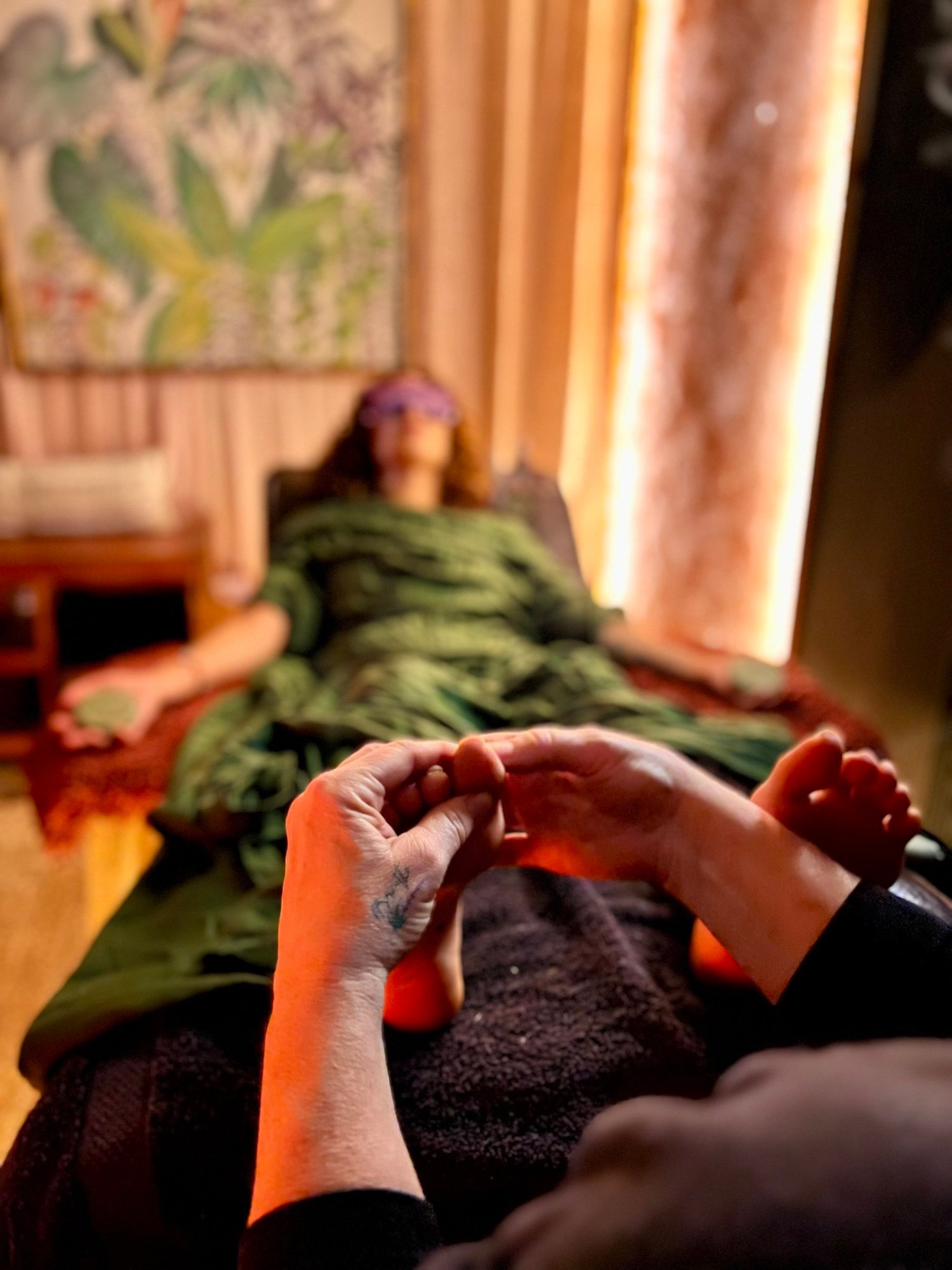
Keep natural skin tones and soft light. Crop respectfully around the teaching subject. Confirm consent and usage rights for any new client photography.
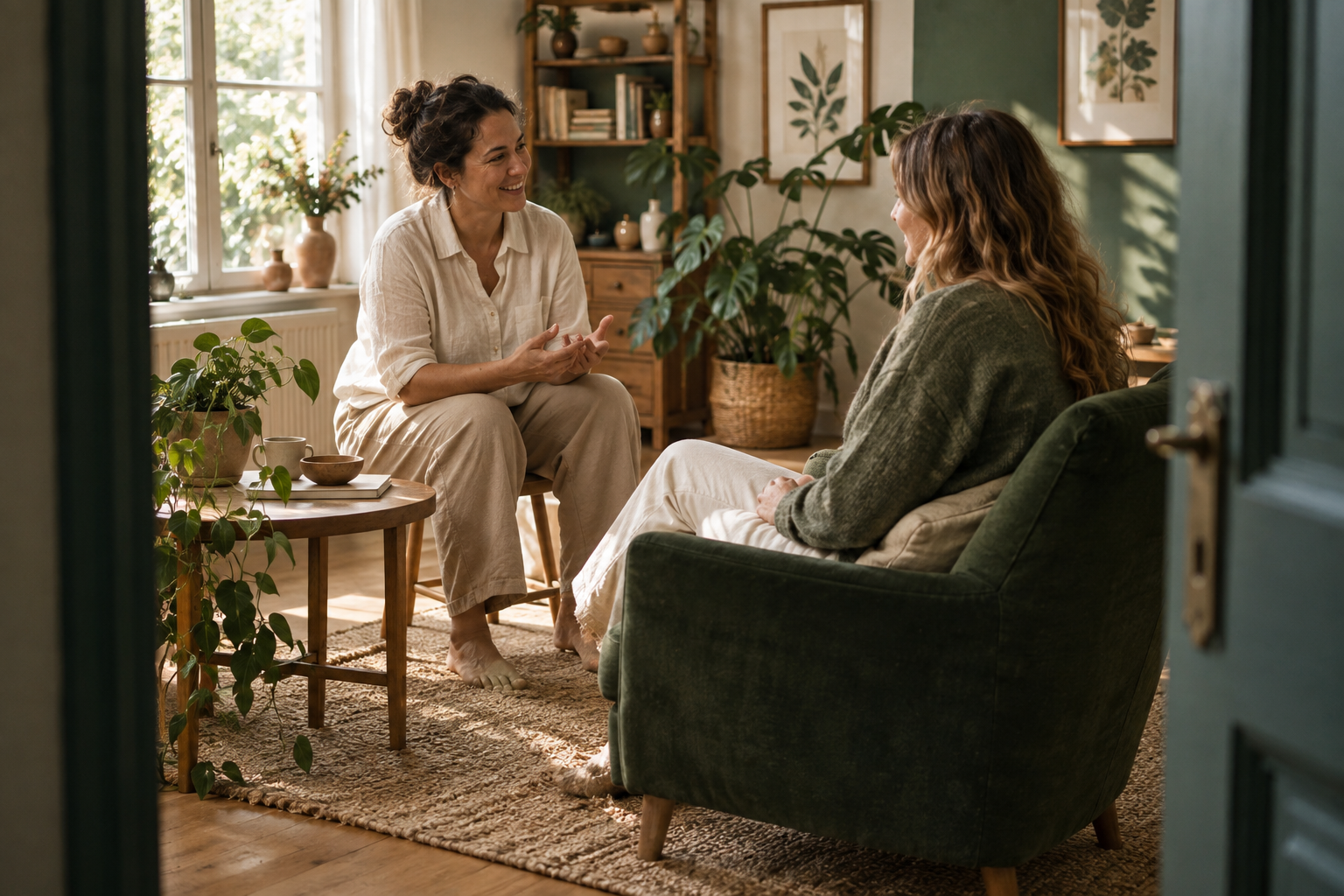
Use the existing twelve images at 16:10 for cards or wide chapter banners. These depict fictional people; they are not evidence of technique or actual learners.

Fine curves echo attention and touch. Use at low prominence around a cover or section break. Keep them away from body text.
Download vector motif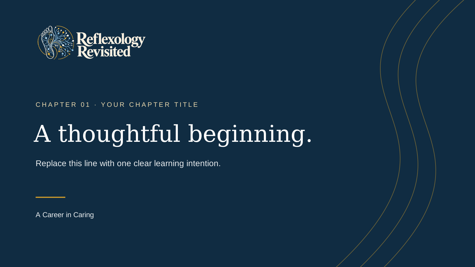
Editable SVG layout for lesson title cards. Replace the sample chapter number, title, and learning intention. Logo is embedded PNG artwork.
Download SVG template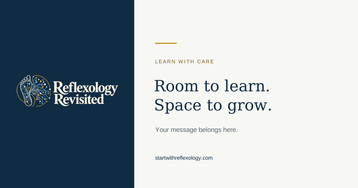
Editable composition for a course update or article. Keep copy brief and use truthful, specific language. The SVG uses Georgia and Arial for portability.
Download SVG templateIcon family: 24 px canvas, 1.7 px navy strokes, rounded ends. Use alongside a visible label; never rely on the icon alone.
The original compositions remain the starting point. Use the same light surfaces, type hierarchy, navy actions, and gold accents from arrival through completion.
White course cards, one navy hero, counts alongside progress.
Open screenKeep chapter artwork, native activity order, and a neutral course index.
Open screenWhite reading surfaces and video frame; quiet neutral guide; a white next-step card with a gold edge.
Open screenWhite questions and inputs; clear labels; visible save, completion, and error feedback.
Open screenNeutral question panels; green, amber, and red only when explaining an actual outcome.
Open screenReadable headings, useful tables, and a consistent download action.
Open screenA restrained navy highlight, real completion counts, and one clear next step.
Open screenThe same light surfaces and navy controls, with existing privacy and capability boundaries.
Open screenWrite as a thoughtful teacher beside the learner. Use ordinary words, give a clear next step, and leave room for individual choices.
Take a moment to notice what feels comfortable. Write one thing you would like to practise.
Short instructions. Concrete verbs. Encouragement tied to what the learner has done. “Your response is saved.” “You completed 4 of 9 activities.”
Unexplained terminology, exaggerated praise, guaranteed income or health outcomes, invented testimonials, and language that implies professional qualifications the course does not award.
Separate Ruth’s experience, traditional reflexology ideas, research evidence, fictional examples, and proposed business plans.
These approved text-and-surface combinations meet a minimum 4.5:1 contrast ratio using the WCAG relative-luminance calculation. This is a palette check, not a claim of whole-site certification.
| Use | Text / background | Contrast | Normal text |
|---|---|---|---|
| Body copy | #243746 / #FFFFFF | 12.28:1 | Pass |
| Body on page | #243746 / #F7F7F4 | 11.44:1 | Pass |
| Muted copy | #59656D / #F7F7F4 | 5.58:1 | Pass |
| Primary button | #FFFFFF / #102C42 | 14.37:1 | Pass |
| Gold eyebrow | #78591B / #FFFFFF | 6.47:1 | Pass |
| Accent on dark | #E9D8AD / #102C42 | 10.19:1 | Pass |
| Success message | #326247 / #EDF5EF | 6.36:1 | Pass |
| Warning message | #765A19 / #FAF4E5 | 5.89:1 | Pass |
| Error message | #9C3933 / #FBEFEE | 6.13:1 | Pass |
| Information | #304F64 / #F0F3F5 | 7.76:1 | Pass |
Reference: W3C: Contrast (Minimum). Download the calculated palette report.
Version 1.0 · 27 September 2026. This guide and its color tokens are the source of truth for school presentation. Keep a single system rather than adding another unrelated color layer.
Nine logo PNGs, four font files and licenses, color tokens, a contrast report, six icons, a line motif, two editable layout templates, and this printable guide.
Download brand kit ↓Open index.html from the extracted folder to read the guide. Fonts remain governed by their included licenses. Ruth’s branding and content retain their existing ownership.
 learn
learn play
play practice
 check
check note
note arrow
arrow